Creator Sphere
Creator sphere is a social networking for creators and brands
Introduction
Creator sphere revolutionises social networking for creators and brands with a focus on monetisation, privacy, and niche engagement. It offers innovation and a unique search engine, encouraging meaningful connections and empowering users to build impactful brands securely.
Project
This platform set out to redefine how brands and content creators connect, collaborate, and grow. It’s not just about posting content—it’s about building real communities, engaging audiences meaningfully, and enabling creators to earn from exclusive content.
Core Idea—
Think of it like a modern marketplace: small and medium-sized businesses get a direct line to micro-influencers who know their niche inside-out. Instead of casting a wide, impersonal net, brands can reach highly specific groups with a more authentic, personal touch. Behind the scenes, audience data stays private and secure, while integrations with third-party apps make content creation smoother, faster, and far more efficient.
Category
Social media
B2B
Tools
Figma
Team
1 × product designer, 2 × graphic designer, 3 × engineers
Timeline
2023-2024
Contribution
UI/UX Design, Usability Testing, User Research, Audit, Prototyping, Design Toolkit
Problems
The Opportunity module faced multiple usability and design issues that limited engagement:
Inconsistent icon proportions and deviation from design guidelines.
Misaligned text, poor spacing, and cluttered layouts.
Opportunity page lost in the menu, confusing for new users.
Badges and rewards unclear, not aligned with user expectations.
No review step during submissions → frequent user errors and frustration.
Goals
Centralise and highlight the Opportunity module.
Simplify browsing and filtering of opportunities.
Ensure clarity of rewards, eligibility, and participation steps.
Introduce a review/confirmation step to reduce errors.
Improve consistency across devices (desktop, tablet, mobile).
Impact
Centralise and highlight the Opportunity module.
Simplify browsing and filtering of opportunities.
Ensure clarity of rewards, eligibility, and participation steps.
Introduce a review/confirmation step to reduce errors.
Improve consistency across devices (desktop, tablet, mobile).
Process &
Context
To redesign the Opportunity Module, I followed a structured, insight-driven approach.
We started by auditing screens across devices—spotting inconsistencies, errors, and friction points. Then, we planned research and mapped user profiles: new joiners, past winners, inactive users.
Next, task scenarios were created to test usability, and 7 participants were recruited for diverse perspectives. During testing, we observed behaviors, noted frustrations, and captured feedback.
Analysis combined analytics, heatmaps, and interviews. Patterns emerged, pain points were prioritised, and opportunities became clear.
We realised we could stand out by:
Simplifying workflows
Automating repetitive tasks
Building trust through clarity
Page Functionality
Opportunity Listing: Where artists browse and discover new opportunities.
Opportunity Details: Providing comprehensive information about each opportunity.
Participation Process: Guiding artists through the steps to engage and submit their entries.
Research &
Testing
Quantitative data from Google Analytics, Hotjar session recordings, and heatmaps was used to analyse click patterns and user journeys, helping form research hypotheses, eliminate obvious assumptions, and create a solid foundation for qualitative testing.
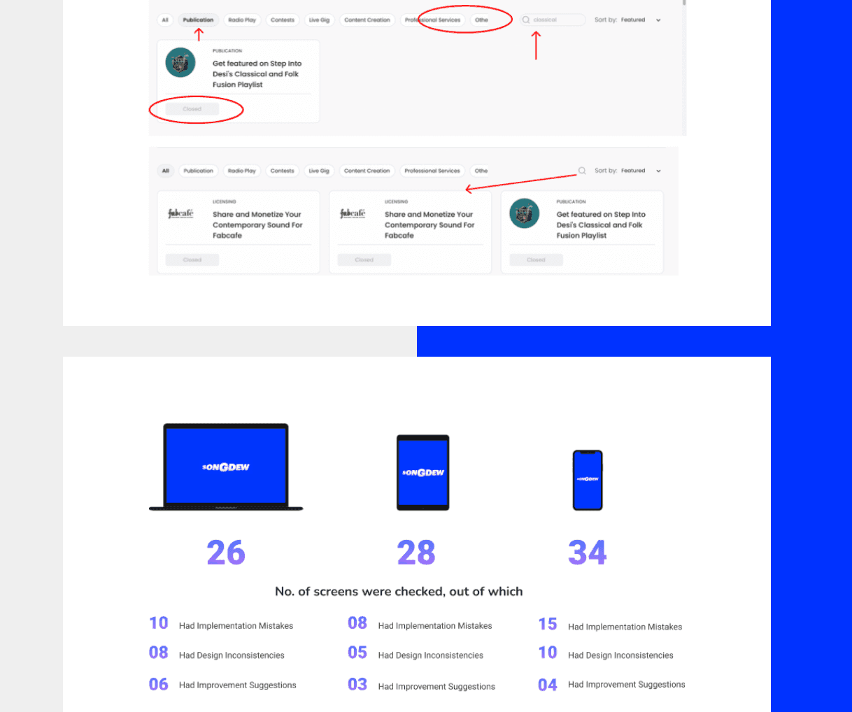
Auditing -
Categorisation of the whole website was done on the basis of devices and module with pictures supporting the issue type like design inconsistencies, implementation mistakes and design suggestions.
Checked for different gadgets like Dekstop, Tablet and Phone.
Maintaining a record of it with proper documentation.
User Profiles
7 users in which 2 were the new users who recently joined, 2 of them were old user who were the winner of opportunity and 3 were those users who joined but not participating in any opportunity.
Findings
Centralise and highlight the Opportunity module.
Simplify browsing and filtering of opportunities.
Ensure clarity of rewards, eligibility, and participation steps.
Introduce a review/confirmation step to reduce errors.
Improve consistency across devices (desktop, tablet, mobile).
Learnings
Centralise and highlight the Opportunity module.
Simplify browsing and filtering of opportunities.
Ensure clarity of rewards, eligibility, and participation steps.
Introduce a review/confirmation step to reduce errors.
Improve consistency across devices (desktop, tablet, mobile).